Designing App Navigation for the 90%, Not the Loudest 10%
Navigating stakeholder bias to design a navigation experience that worked for everyone
Company
SYNAPSIS
Year
Q3 2025
Role
Designer
Key Result
Reframed the product direction
We challenged the assumption that personalization was the best solution and aligned stakeholders on a solution that prioritized the needs of the 90% while still supporting the 10%.
Secured the next project phase
We couldn't gather proper usage data at this stage. But the direction was strong enough to secure the next phase contract with the client.
The start of my initiative
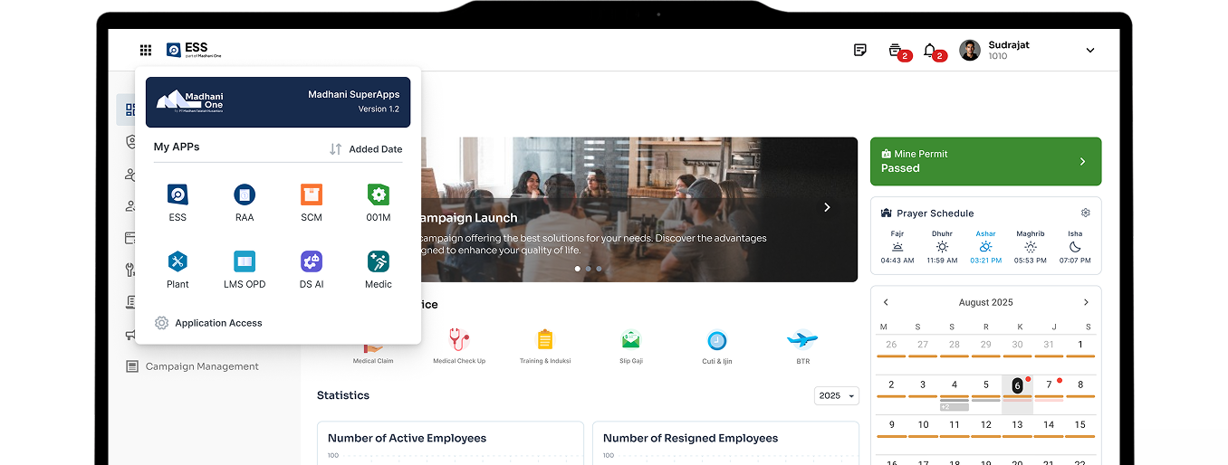
We were working on a multiple app for a client and they wanted to merge all the app into one. The concept is one main app with shortcuts to switch between the others.
During the concept presentation, the client made a specific request :
Add a personalization to the app list shortcut
They wanted the app list to reorder itself based on which apps each employee uses most, so frequently used apps are always front. They don’t want to be overwhelmed by the amount of app.
Exploring Design Direction
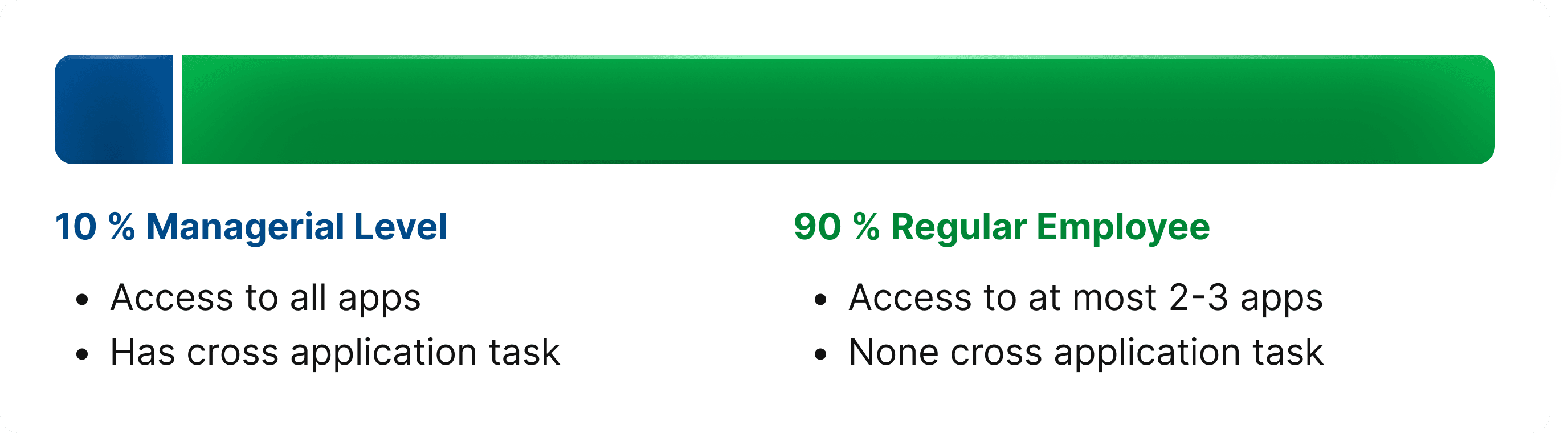
The client's concern about being overwhelmed was shaped by managerial users, the 10% who have access to all apps. While we recognize this as a real concern that deserves attention, we also note that most users will only have 2–3 apps.
For the rest 90%, an auto-reordering grid personalization wouldn't solve anything. It would add unnecessary complexity to a problem they don't have.
We needed a solution that worked for both, including the ones who never made it to that room. This gave us two clear directions:
Seamless
for users with a lot of apps, the experience should feel manageable and quick to move through.
Efficient
for users with fewer apps, no added complexity they don't need
Solution Overview
Leveraging Spatial Memory with Grid Layout
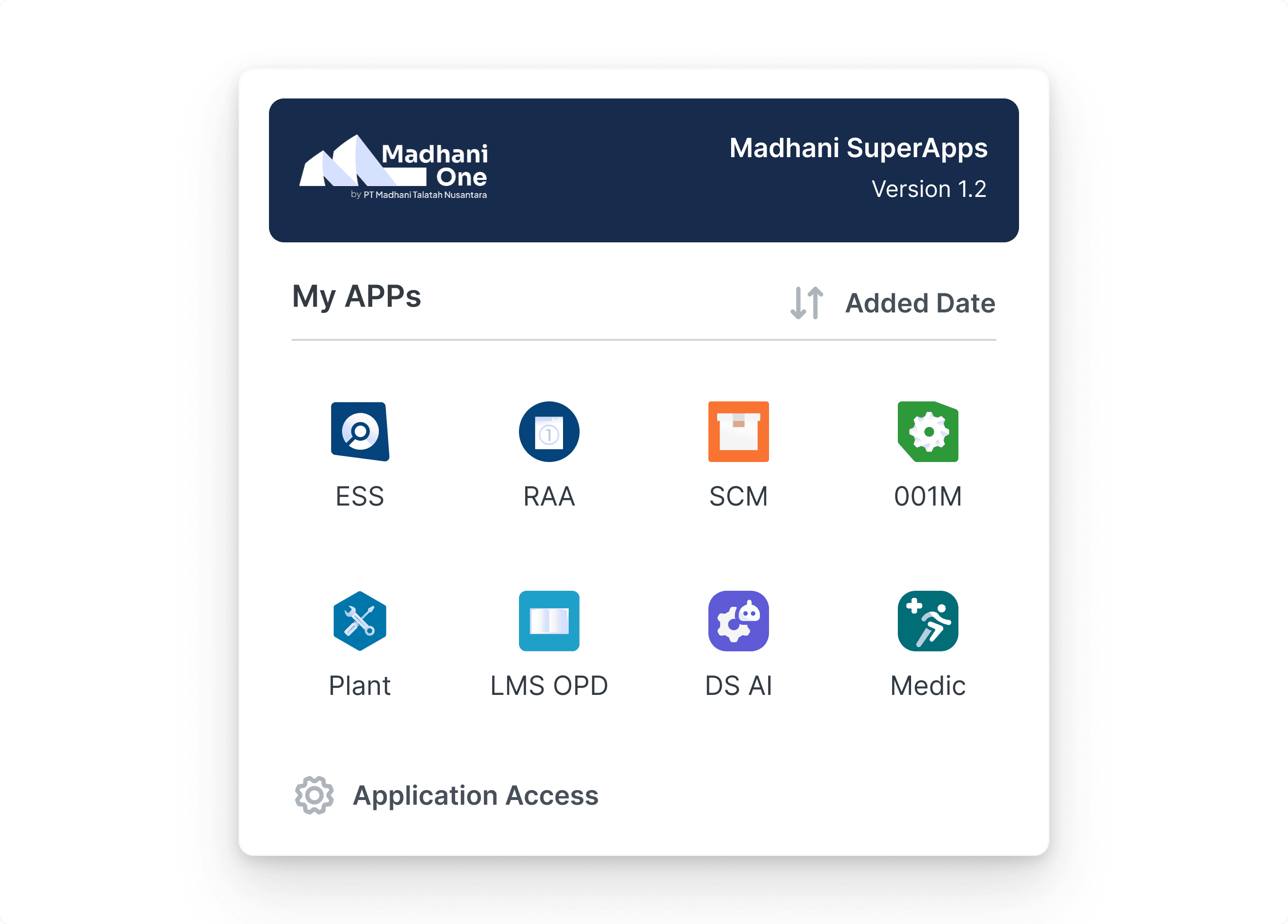
A grid layout was used to keep every shortcut in a fixed, predictable position. With repeated use, users build a spatial memory of where each app sits. Users can eventually find a shortcut without consciously looking for it.
Customization over personalization
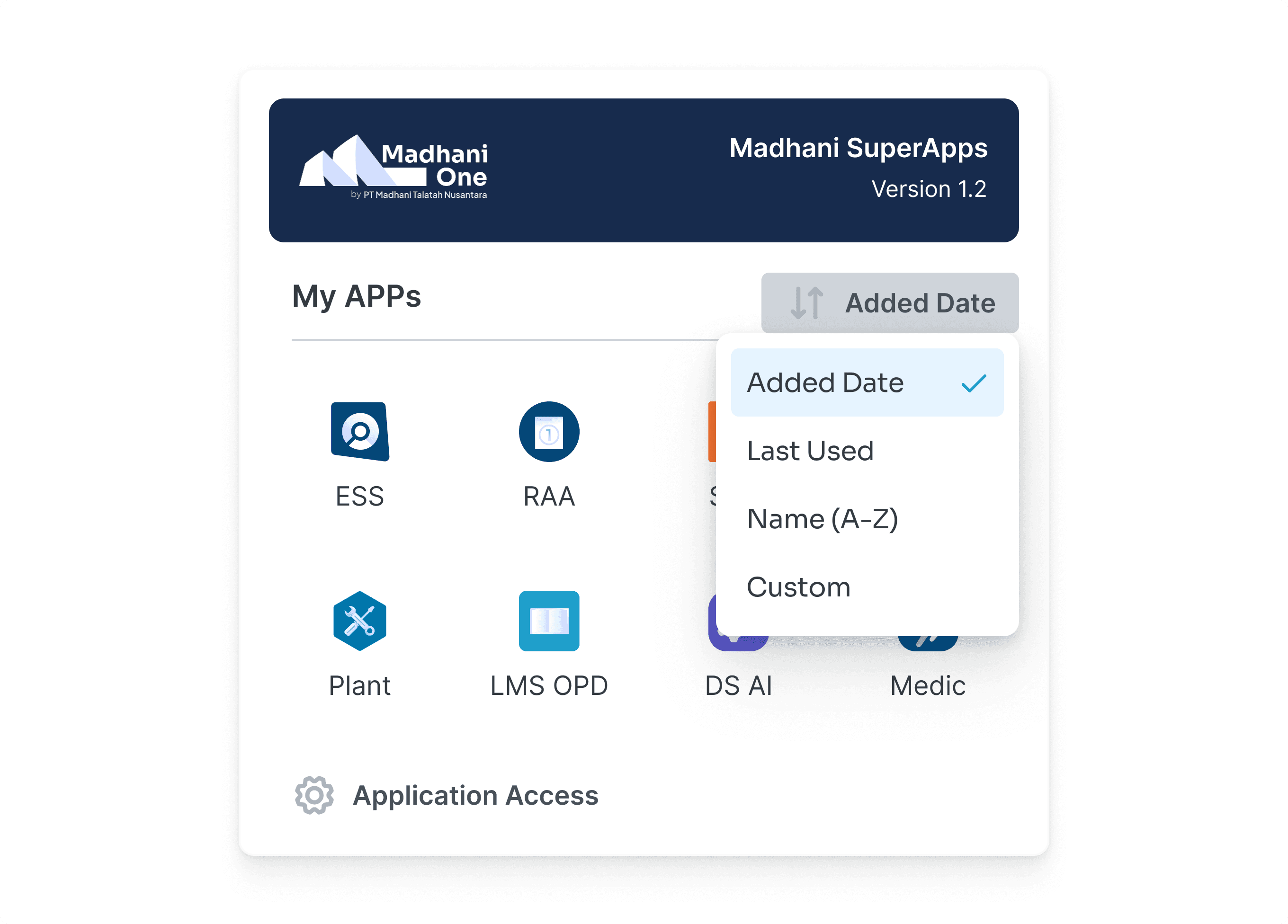
We didn't build toward personalization. Instead, we reframed the goal back to the client with customization. Customization allows the layout to adapt without forcing users to relearn the interface.
User-initiated sorting gives users a stronger locus of control. They can immediately attribute the change to their own action, which reduces confusion in early use compared to unexplained system behavior.
This way we able to solve the issue of user being overwhelmed but not adding unnecessary complexity for user with less apps.
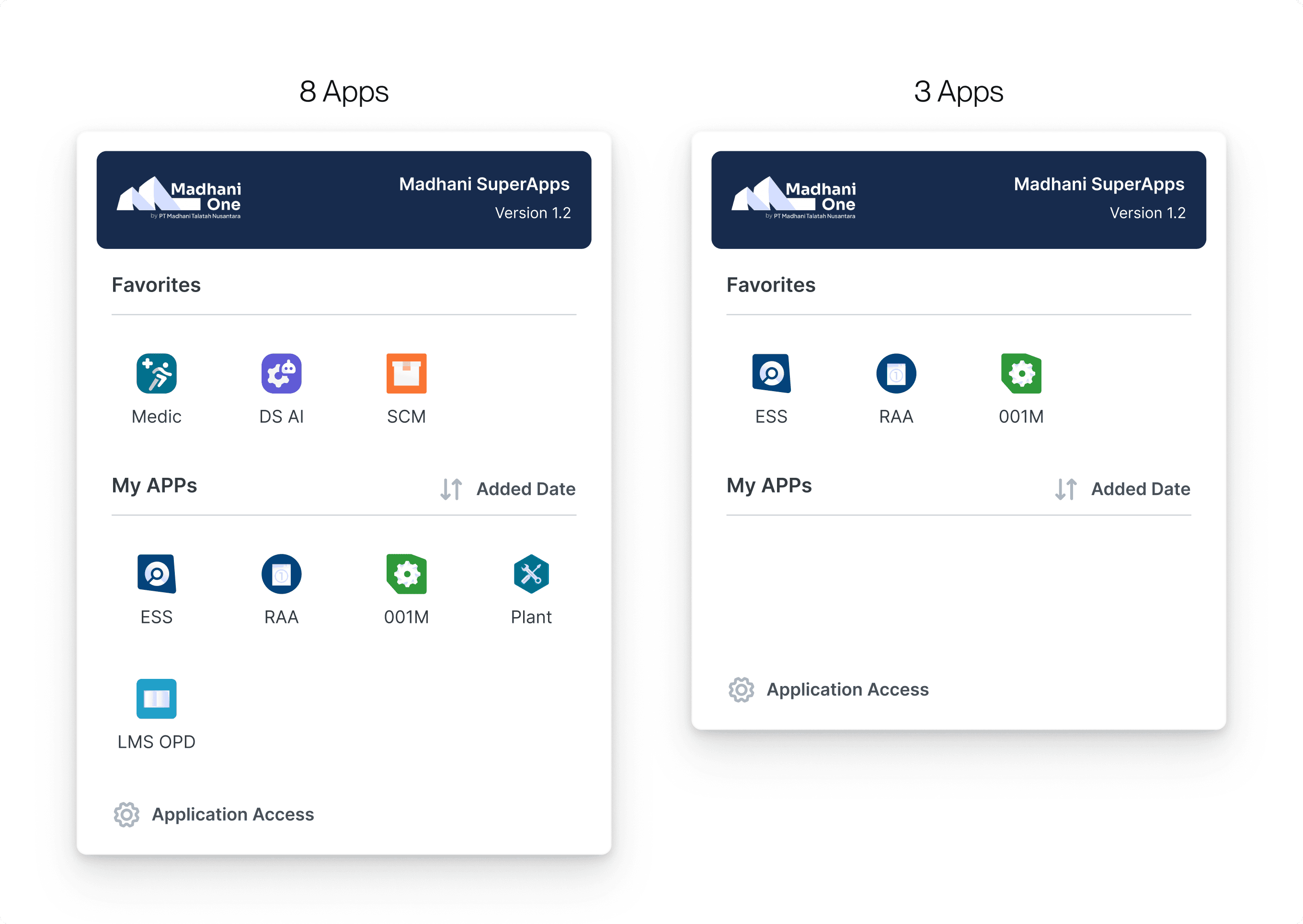
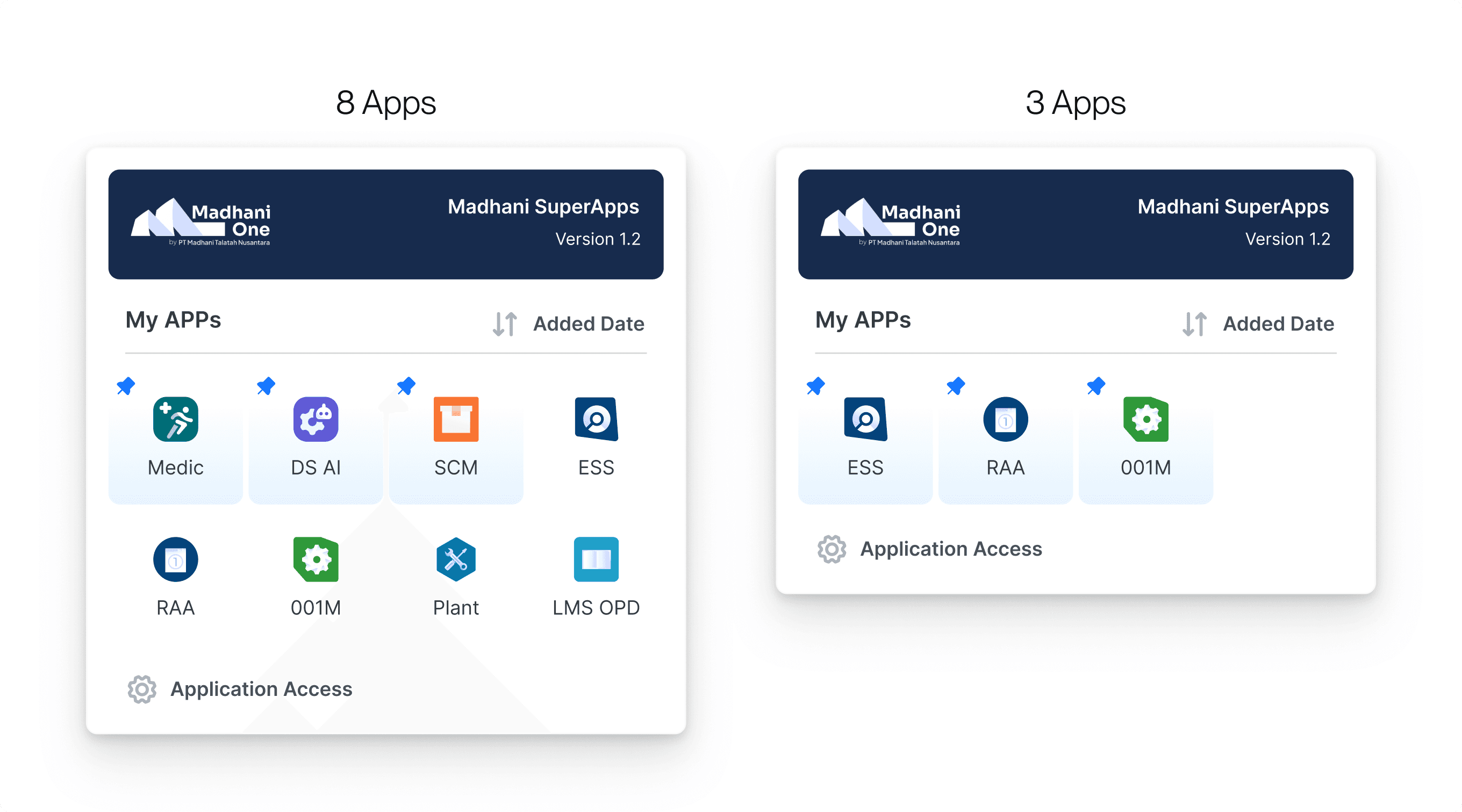
Integrated Favourites Section
Initial Experiment
Separated section wastes space when there are only a few apps.
Final Version
An integrated section keeps the layout efficient for both experiences. It scales with the number of apps.
Try The Live Demo
Open the site on desktop to try the live demo.

My APPs