
Scaling a Design System Across Multiple Brands
Most design systems are built for one product. We were building one for many.
Company
SYNAPSIS
Year
Q2 2025
Teams
7 People
Role
Design System Designer
Key Result
The system covered around 64 core product components.
It supported tokens, brand theming, and dark mode.
Prevented future licensing issues
Discovering that the current system had significant structural overlap with the Atlassian Design System was a key not just for the project’s roadmap, but also to prevent our product to be exposed to even bigger licensing problem.
Background
Our company runs two types of projects in parallel: internal product development and client-based projects. Our internal product already had a design system called Sensory. Sensory was built for one product, in one context, by one team.
As client projects grew, the team decided to scale Sensory into a multi-brand system that could power both the internal product and client projects, making development faster across the board.
Before jumping into the build, I ran an audit to understand what we were actually working with.
What’s wrong with the current system
The audit surfaced five findings:
1. Sensory is not a system
Sensory turns out to be only a Figma component library. There was no shared language established across the team.
2. Token structure
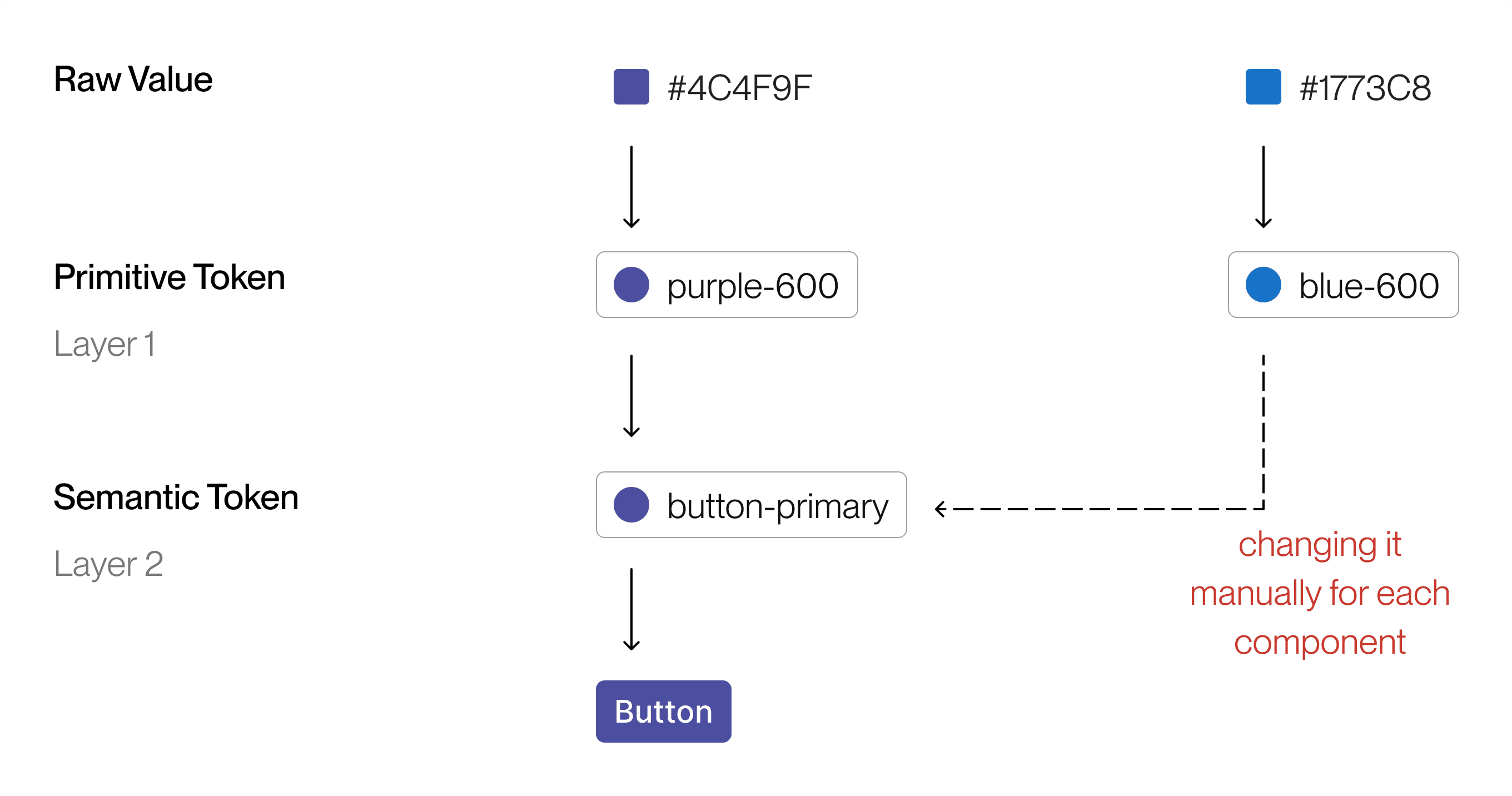
Tokens existed as a Figma variable, but were built for a single brand.
3. Component flexibility
Icons, logos, and other variable elements were hardcoded into components, not exposed as replaceable parts.
4. Component architecture
The library had some components that missing variant, redundant properties setup, and built for specific use cases rather than abstracted into something reusable.
5. Properties and naming consistency
There were no shared conventions for how component properties were named.
The Risk Nobody Had Caught
During the audit I identified that Sensory's components had significant structural overlap with the Atlassian Design System.
With the internal product planned for external distribution and client projects already in flight, continuing to build on top of it wasn't viable. I flagged it and recommended a clean break from the affected components entirely.
The lead made a different call. Given the goal of moving faster, a full rebuild wasn't on the table. The decision was to rebuild some components that “looks Atlassian” and use the more general component as it is. I disagreed, but it was the decision that was made.
Building the Shared Language
Finding number one made something clear, we need to build a system from the ground up. And that started with the team.
The engineering team hadn't worked within a proper design system before. Without that shared context, design and engineering were operating from different assumptions about what the system was supposed to do. The approach that We took to overcome this is to :
Talks
We had a lot of conversations to build the same understanding of what we wanted to build. The vision is to land both sides on the same principle: design system should be one language, one source of truth.
Scaling Up the Design System
The scaling approach was grounded in atomic design principles, but we extended the model to fit our context.
Design token restructure
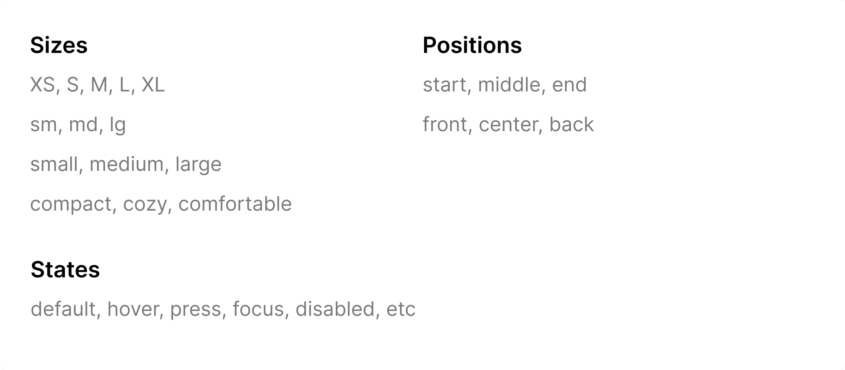
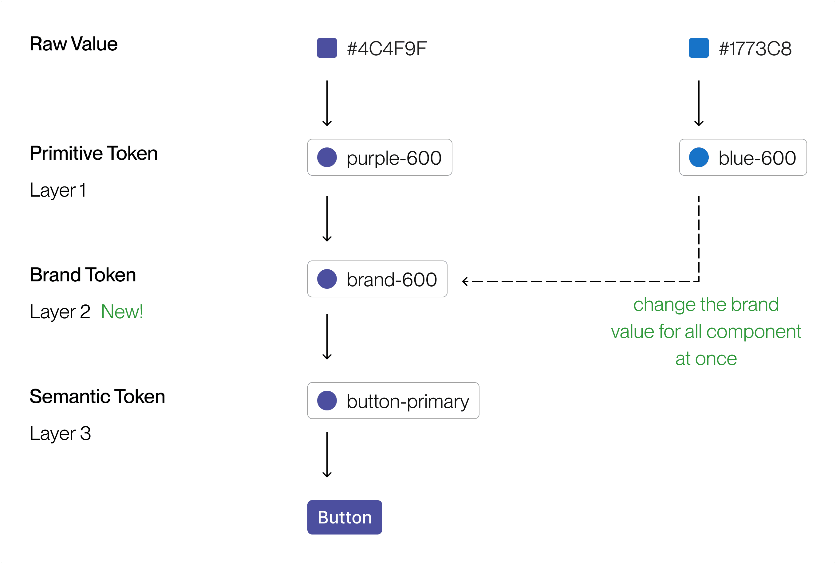
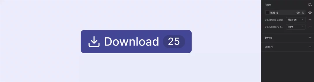
We restructured the token architecture into three layers : Primitive Layer, Brand Layer, and Semantic Layer. The brand token layer is what makes multi-brand possible. One change there and every component that references it updates automatically.
Properties standardization across teams
We established explicit agreements across design and engineering.
When we say size Medium, we both mean 32px. When we say spacing Large, we're referencing the same token value. The goal was to make sure that what gets designed and what gets built are the same thing.
Component Restructure
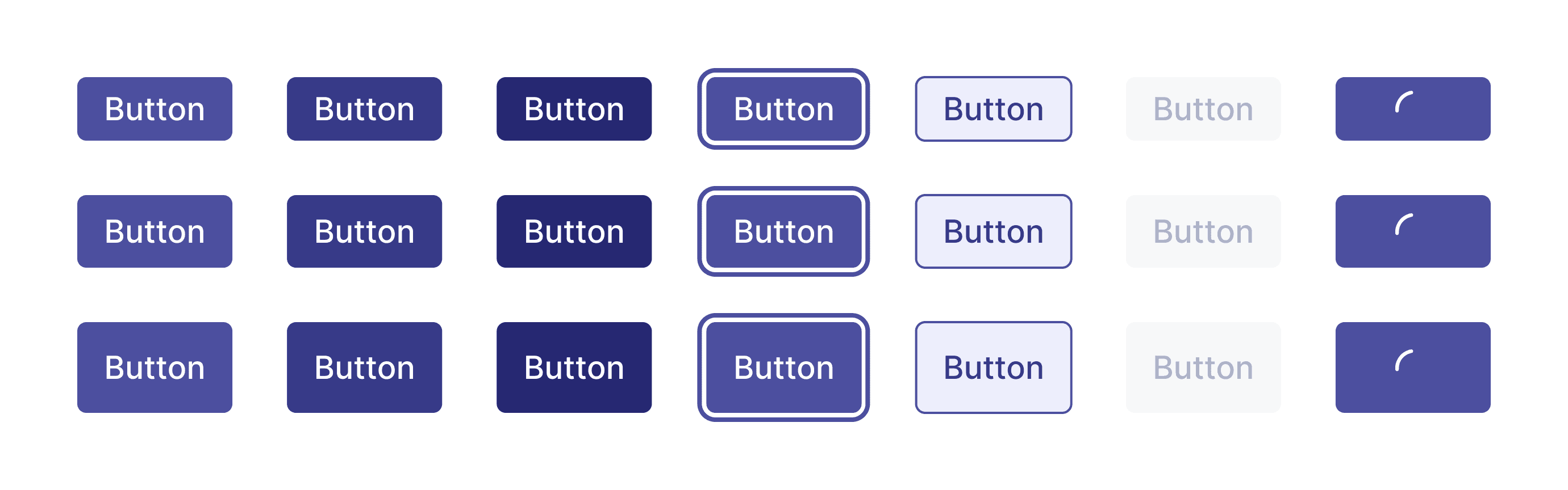
Before building anything new, we cleaned up what was already there. Merging similar components, completing missing variants, and fixing broken properties.
We restructured everything around the idea that a component should be reusable, consistent, context-agnostic, and adaptable enough that consumer teams can make it work for their specific needs without breaking it.
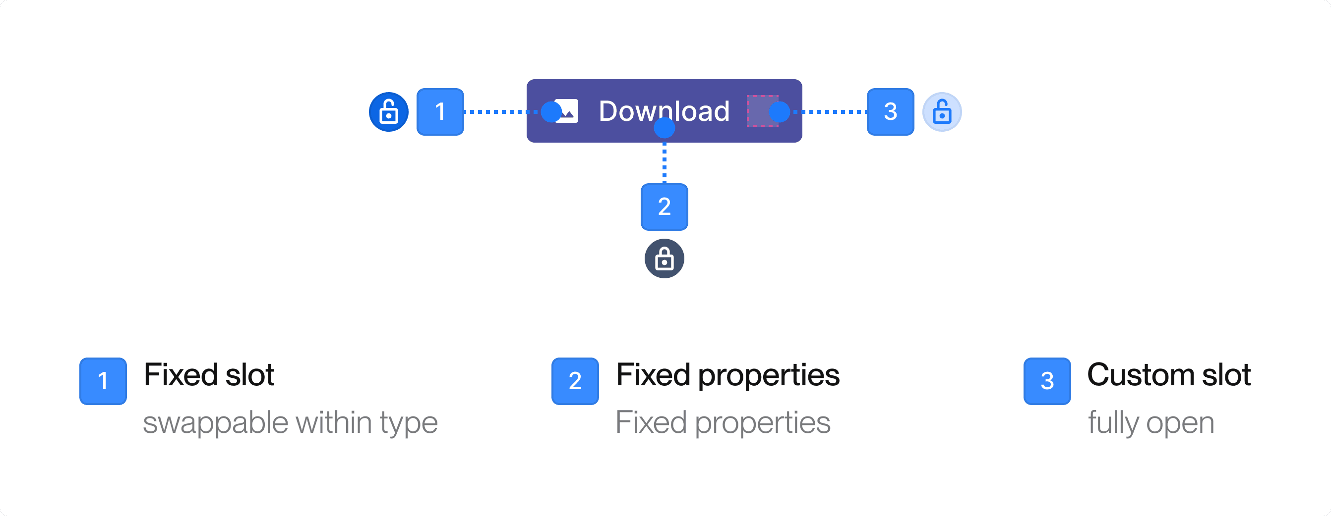
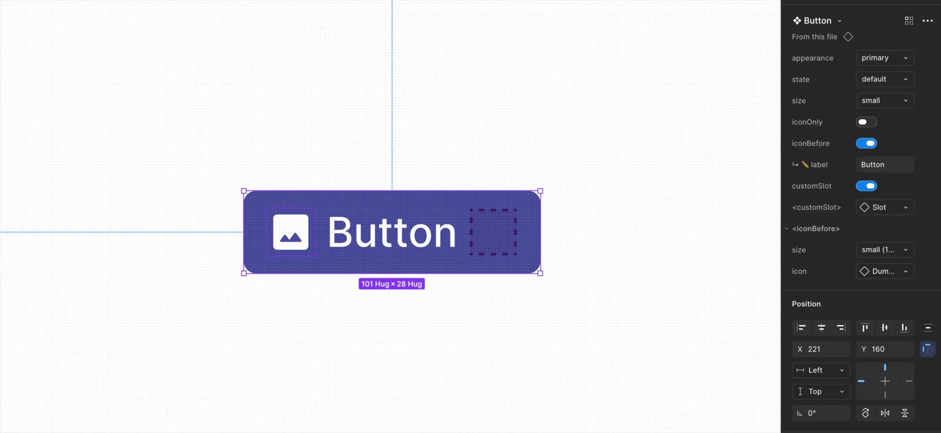
Adding flexibility with slot component
Before Figma had native slot support, we addressed the component flexibility problem by building our own. Consumers could insert custom content into predefined parts of a component without detaching it.
Managing snowflakes
Working across multiple client projects means each project will occasionally have needs the system doesn't cover yet. Instead of treating those as exceptions, we saw them as opportunities to contribute back to the system.
We created a separate snowflake component library to hold these project-specific components. The snowflake library is shared and reusable across projects. Over time, components will be evaluated for integration into the main system.
Next Steps
Brand Freedom
We believe branding is more than changing colors and fonts. One of our goals in the next phase is to give the system more freedom to express different brand identities. This way, the system can be implemented across a much wider range of clients.